


4 Design Concepts Small Biz Entrepreneurs Often Miss
 This might seem pretty obvious at the moment, but bear with me: everything man-made around you had to be designed. The floor under your feet, the roof over your head, the computer or mobile device you’re viewing this through – these things didn’t pop out of nowhere. People had to design them, and the processes that made them. And that process can be a lot of work.
4.) Good Design Often Goes Unnoticed – For Good Reason
Have you ever wondered why the numbers on your phone are arranged the way they are? Why would they be arranged differently from say, the numerical keypads on calculators and keyboards?
Take a couple of minutes to look through this (very British) video on how Bell Labs came up with the standard numeric layout nearly all phones share today:
Seems like an awful lot of work for something we take for granted. Sure, a lot of the time, you’d rather design to delight, rather than to be coldly functional. But sometimes, trying to delight someone can be a pain in the neck. Take a look at this coffee mug. 
Via theappslab.com
This coffee mug would be great for scalding your neck. One wonders if it’s any improvement on conventional mugs, as the handle would require a far more active grip. Unless the mug is made from some sort of material that keeps your hands from getting burned when you touch the body – which this isn’t – it makes little sense to have a grip designed this way.
We hardly notice conventional mugs because– well — they work.
3.) Design Goes Beyond The Physical
All entrepreneurs will have to design something at some point. Whether it’s a product, a user-interface, an office or premises layout, a business tool – at some point you will be forced to consider how your design decisions will impact not just your own experience, but those of everyone you interact with as well.
Speaking of bad user-interface, here’s a particularly interesting example. We’ve all seen funny message prompts like this one. Like the coffee mug and the phone number layout, someone had to have designed it. 
via Imgur
This makes it clear that design is not just for physical products. Conceptually it applies to copy and graphic design as well. Logical order and a clear communication of function is absolutely necessary. Take a look at this ad: 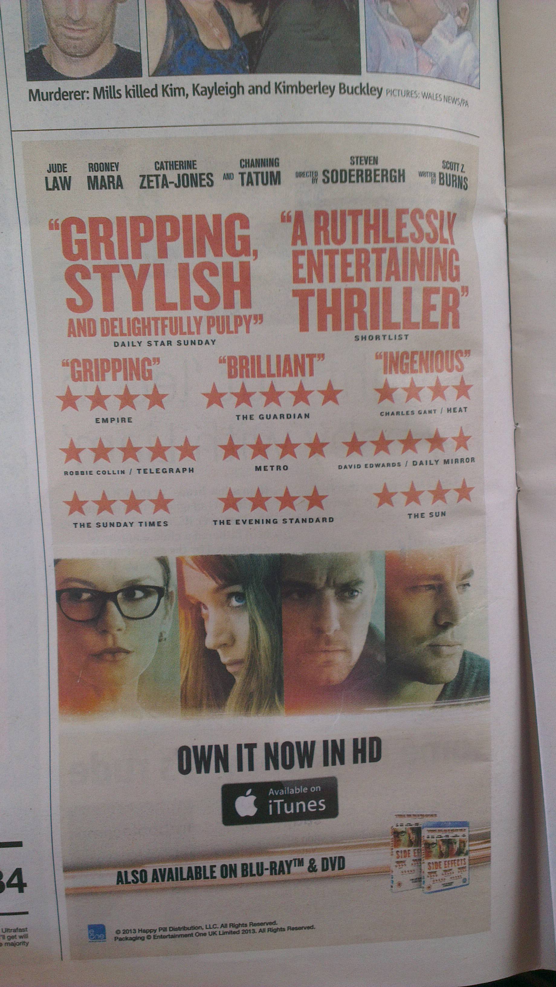
via Imgur
It took me a while to figure out what this movie was. After some zooming in, I finally saw the title on the lower-right part of the ad, on the DVD boxes. It’s pretty obvious that you likely couldn’t really order a movie without knowing what the title was, no matter how “ruthlessly entertaining” and “delightfully pulpy” it is.
2.) Extra Features =/= Good Design!
It’s also important to consider design when ordering fixtures and equipment. If you were a programmer or a gamer in the late 90s or early 2000’s, you might have seen keyboards with this horrible layout. I had one of these and it was a huge pain to deal with. Can you see why?
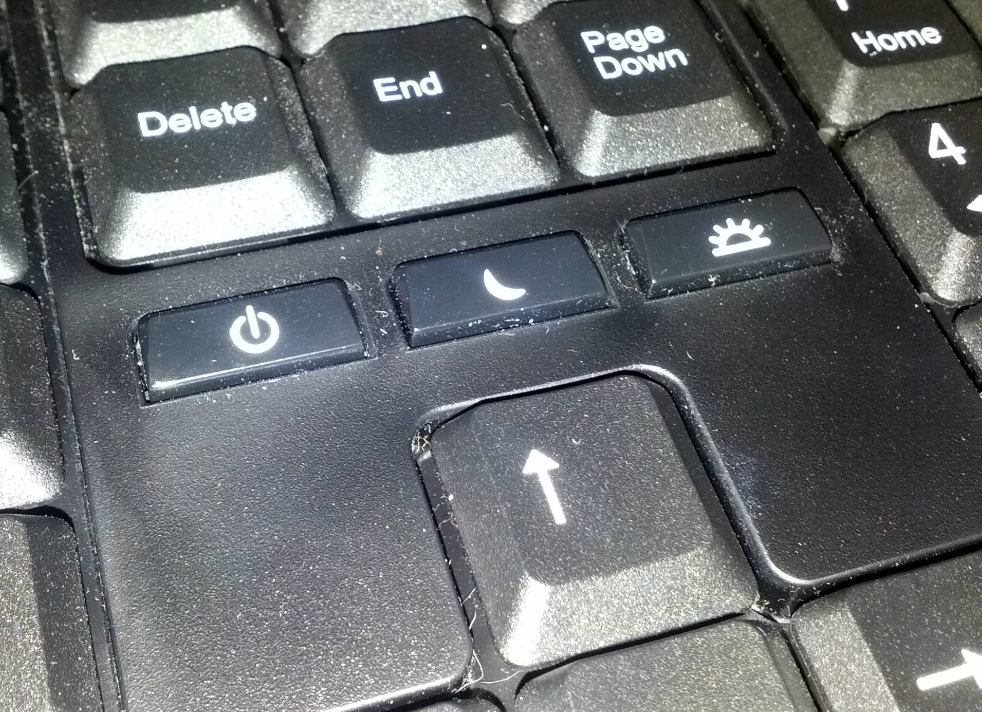
via Imgur
Many programmers (and writers) use the arrow keys to navigate through prompts and documents. The “Delete” key is right next to the “Shut Down” button. It’s way too easy to miss the Delete key, one of the most used keys on your keyboard, and cause your computer to shut down. You can set up your keyboard to disable that set of buttons, but that just begs the question of why they should be there in the first place.
Now recall all the badly designed cellphones and applications we’ve used and it’s easy to see that extra functionality (usually aimed at delighting customers) can actually be a hindrance when not implemented correctly. Sometimes with funny results.
This motion-sensing paper towel dispenser was probably installed to reduce paper-towel waste. Unfortunately, no one seemed to have considered the restroom layout.
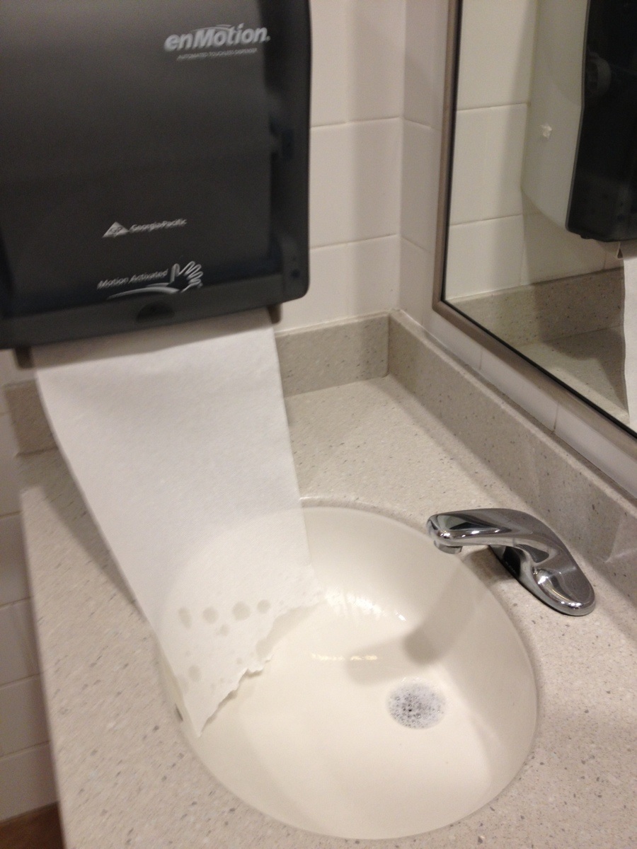
via Reddit
Reddit user Zachydj writes ” this automatic towel dispenser is so close to the automatic faucet that it dispenses towels whenever anyone washes their hands. Even worse, the towels go straight into the wet sink“. Ironically, instead of saving paper towels, the setup ensures that a lot more are needlessly wasted.
We also had a similar problem at our office when the automatic urinals were set too close to the toilet stalls, causing them to flush even whenever someone needed the stalls, negating the whole water-saving idea behind the installation.
We recently discussed Goldilocks pricing in a previous article, and it ties in nicely to the idea that more doesn’t always mean better. Whenever you add options, they have to make sense with what’s already there.
1.) Testing and Empathy
The video at the beginning of this piece said it differently, but these are the keys to a workable design. What Bell Labs did was they took a bunch of designs they “felt” might work based on previous standards and educated hunches (as well as a bunch they just went crazy with), and they tested the heck out of them.
In some cases – like in the restroom example, you can’t really test things beforehand. In this case, you have to imagine what the user experience would actually be like and make an educated guess from there. If anything, this should reduce the chances of a messy rectification in the future.
This is really simple stuff. Pretty obvious, right? But then you see things as frustrating as this gas station self-payment keypad…
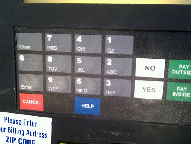
via imgur
…then you realize that when things go smoothly in the man-made world, it’s because someone rubbed more than just a couple of brain cells together so you won’t have to. When things don’t go smoothly, it’s often because someone didn’t understand or care about users, or because they didn’t test their solutions enough.
Whether it’s a car, a business card, a coffee mug, an app interface, or a restroom — the need for good design will continue to be an essential part not just of a positive human experience, but of good business as well.
Disclaimer: PrintRunner is not affiliated or otherwise connected with companies mentioned in this post. Any opinions presented are solely their author’s and do not necessarily reflect PrintRunner’s.
Sources and Additional Reading
10 Usability Heuristics for User Interface Design by Jakob Nielsen, January 1, 1995
What Versioning and Goldilocks Pricing Mean For Your Small Business – PrintRunner Blog
All the entries here: 11 Must Read Design Books – 99 Designs
Image Sources
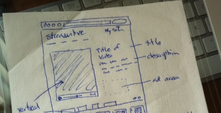
Napkin Sketch Terretta via photopin cc
Coffee Mug – theappslab.com – Adventures in Bad Design
All other Images via Imgur via Reddit.com
Author Bio
 Arthur Piccio is one of PrintRunner Blog’s resident Admins. He is also the head writer for The Art of Small Business. His work has been featured on New York Times’ You’re The Boss Small Business Blog, Bizsugar, SmallBiz Trends, and other small business and printing-oriented online publications.
Looking for more ways to save money and gain more capital for your business? Download your FREE copy of the 100 Practical Solutions for Business Growth to learn more advice on how you can grow your funds and business!

Great article on the importance of good design.
I think one thing that’s important in getting a good design is simply having it field tested by someone else – while the designer is often “blind” to the mistakes made, an impartial user can give important feedback on which changes can be made before that product is released to the public.
Thanks Daryl!
I agree with field testing. Sometimes it’s difficult to see something as it really is because you’ve got a lot invested in it emotionally. Definitely something to look out for.