


4 Simple Ways To Improve Horrible Ad Copy
Better Ad Copy For Any Entrepreneur
Ads are probably the sexiest thing in business. They simplify ideas, give color, and humanize commerce. They seem so sexy and simple that it seems everyone wants to create ads. I can almost hear marketing and advertising professionals roll their eyes at the idea.
Pop culture figures like Don Draper exemplify the supposed sexiness and simplicity of advertising. Unlike in the 60’s, now anyone with time to kill and a little money to burn can make an ad. PrintRunner in fact, helps make that happen. Technology has democratized advertising and the creation of ad copy in so many unexpected ways.
But if it’s so simple, how is it that we often see ads that are totally indefensible like this one?
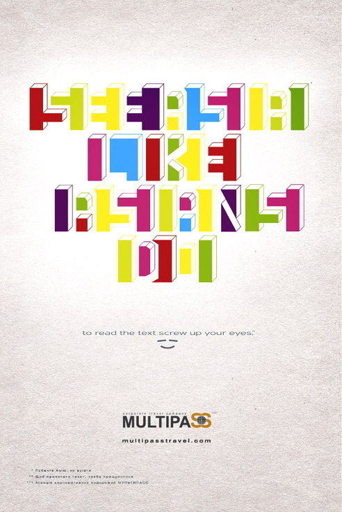
Tabasco, Kiev for Multipass
Believe it or not, this wasn’t just a concept for someone’s Behance account. It’s an actual ad that got distributed. Not only is it too much work to make out what it means, when you do learn it, it’s hopelessly racist. It seems there’s just no way anyone who had an iota of sense would come up with an ad like that. Yet there it is.
Cultural sensitivity aside, it still takes a lot of hard work to make an ad copy that is actually worth the effort. I’m not even going to talk that much about distribution, which is a whole ‘nother kettle of fish.
You want to be noticed. And you want to look good.
Ad copy by novice entrepreneurs are often doomed from the start. Here’s just four things about creating an copy that you should never forget. Be sure to read the sources at the end for a more in-depth understanding of what makes ad copy effective:
4.) Your Ads Should Not Be About Making You Feel Clever
We’ve all seen ads where it takes more time than it should to understand. There can be two reasons for this:
1.) The ad wasn’t meant for you.
Or
2.) The ad copy was more interested in using an idea, not selling a point.
Not speaking for anyone but myself, #2 seems to be far more common than #1. It’s entirely possible that I’m an outlier or am simply too stupid to immediately understand the point of some ads.
But based on some familiarity with how advertising copy are made, creative directors or clients might unwittingly get too attached to certain ad concepts, completely forgetting whom the ad is meant to target.
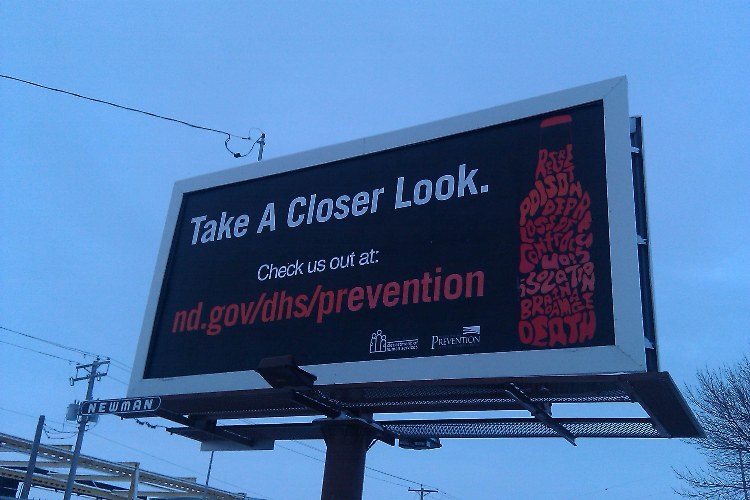
North Dakota Department of Human Services
This North Dakota state-sponsored alcoholism awareness ad for example, would have been great on a flyer. If you were driving past this, however, you probably won’t have time to “take a closer look”. As a matter of fact, doing that would probably put you at risk of an getting into an accident.
Do you think you’ll remember to take down the URL or read through the text in the bottle? The design is very clever, but the way it’s presented actually poses a danger to drivers.
It seems obvious in retrospect. It’s all too likely someone may have invested too much time in it or just plain convinced themselves it would be a good idea to have this design on a billboard.
It doesn’t just happen to egotists. It happens to all of us. None of us are unbiased and most of us unconsciously want to feel we’re experts at something. We all want to leave our mark somewhere. That’s not malice or stupity – That’s just how human nature works.
This problem doesn’t just concern ad copy either. It’s absolutely prevalent in web design. It may actually be useful to consider webpages ad copy that you can directly interact with.
You should always be asking yourself how you’d like your target audience to react- and if what you’re doing can actually do that. Empathize- then measure the results after. After all, your hunch might have been mistaken.
Related Article: Seriously Punny Business: The Universal Language of Puns
3.) Copy and Visuals are Two Sides of the Same Coin
Not all of us are fortunate to have access to both good writers and visual designers. Relatively few people are good at both these things (or as good as they believe they are).
It’s true you can make ads that are almost entirely visual or entirely text (though font choices still count as visuals, more on that later) – but don’t count on doing them particularly well either. In the past few generations there has been a general movement favoring less text and more image-heavy copy.
The amount of text on a lot of older ads is often ridiculous by today’s standards, and it’s probably for the best that they don’t do that sort of thing anymore.
But it’s gotten a bit out of hand. All too often, even the most interesting images are just too vague without the appropriate amount – or quality -of copy. Not using enough copy can also result in lost opportunity to explain your side.
Contrast the apparent message between these two similar (plagiarized, perhaps?) ads. Which do you feel actually needs to be explained to people you know?
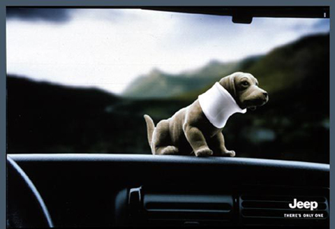
KNSK Werbeagentur for Chrysler LLC
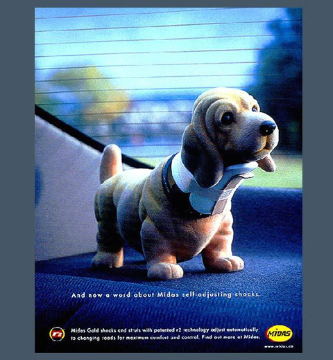
John St.; Annie Lee/ Oglivy for Midas
The Oglivy example in my opinion is much clearer and unambiguous – precisely because it has text in the right amounts. As far as we can tell, it also came out before the KNSK sample.
Unfortunately, not everyone is talented at creating both copy and images. This is why you have to go over your ad copy with both writers and visual designers – preferably with experience relevant to your target audience.
Again this also extends to websites and virtually everything that your customers can see or interact with. Even invoices and letterheads can add – or detract – brand value depending on how they’re designed.
Again, it’s about understanding the perspectives of the people you’re trying to reach – and the mediums you’re using. Clearly, you can’t be too wordy on billboards and business cards and can afford to use more text in brochures and magazines.
2.) You Can Talk With Images – And Text – In More Ways Than You Expect
“A picture is worth a thousand words”, sure. But we can forget images by themselves can be puns, satire, expositions – almost anything that we associate with the written word.
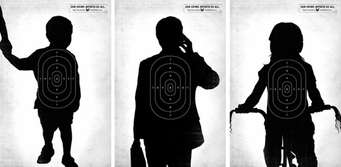
Gun Crime Affects Us All; John St. for The City of Toronto
Fashion magazine ads are perhaps some of the most common examples of images working as ads almost entirely by themselves. The clothes are there, you see how they fit, get some idea of the texture— what else is there to talk about?
Even without additional text there are plenty of things to say. A dark, industrial background can make your brand look “edgy”, while a clean one can make it seem more wholesome, or whatever the opposite of edgy is. You can feature situations you want your audience to imagine that can be in – you can in the true sense of the word, sell not just clothes, but dreams and lifestyles as well.
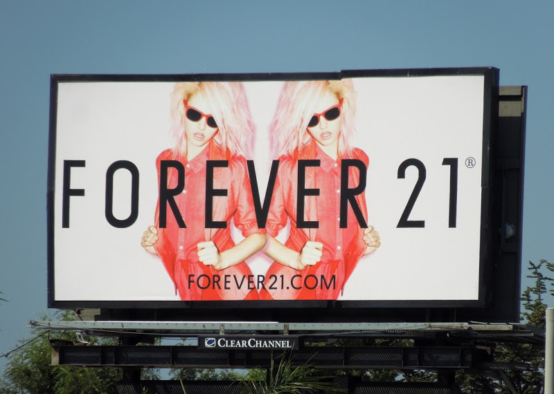
space150 for Forever 21
You can even tell jokes with images, or bring to light serious issues even without a single word – provided you know your audience understands the context.
Font and typeface choices also say things about our brand. Think back on all those comics you’ve seen that ever had a talking robot and computer, and chances are the text is rendered in an approximation of a computer monotype font. Or the ongoing debate whether fonts like Wonton and others like it are racist – which wouldn’t have happened if people didn’t believe typefaces meant anything.
Fonts say and represent ideas almost as much as the clothes we wear. Something written Comic Sans will often imply something else entirely than something written in Futura or Papyrus. Helvetica is particularly popular with a lot of brands (including the United States Government) that want to project a sense of order and familiarity.
1.) Your Headlines Matter –More Than Anything
This means don’t clutter your ad copy. If there’s something we usually don’t feel we have enough of, it’s time. We can’t stress this enough. You can have a really compelling image and ad copy, but if you can’t write good headlines – and frame them right- no one one will want to give you their time.
This is true for almost any medium, online or offline. Headlines aren’t just things we see on newspapers or on articles like this. Headlines are the most noticeable bits of text on any copy. They can be a tagline on a poster or brochure, or your name and title on a business card. They can even be your company’s mission statement. Or a web URL or a phone number. Or for the lucky few businesses that are already in the public eye, just their company name.
A headline is whatever text you want to be noticed.
There’s not single way to make an effective headline. The headline on this article goes straight to the main idea. It should help on search engine results pages, and tell someone right away if they would want to read it. It also implicitly suggests that it will be easy to read- because it promises as list. Whether or not I follow through is another question.
Sometimes, images might actually be unwelcome – if your headline’s well-presented:
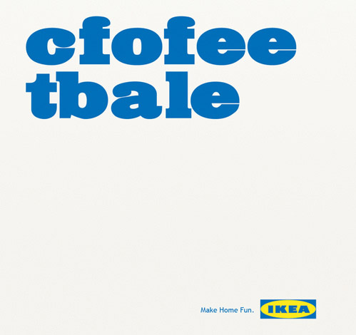
Matt Carvalho for Ikea
Even if i wrote the best possible copy on the subject and included great images – no one would care enough to know that if I didn’t include a good headline.
Your headline is the first thing people will read. Make sure it’s not the only thing. Make it count.
Additional Reading and Sources
An Inconvenient Truth for Copywriters – How to Write Headlines And Why Your Career Depends On It – ihaveanidea.org
Is Your Business Font Racist –Wall Street Journal
The-Six-Basic Rules Of Billboard Advertising.htm – About.com
medialiteracyproject.org- Bad Ad Schick Hydro 3 – A great dissection of a “bad ad”
flickr.com/photos/nmmlp/ Media Literacy Project Photostream
10-Business-Card-Mistakes-You-Might-be-Making – marketingpower.com
Headlines Matter – Door37.com
Here’s Visual Proof Your Headlines Matter – Junger Media, LLC
Photo Credits:
KNSK Werbeagentur for Chrysler LLC
John St.; Annie Lee/ Oglivy for Midas
Gun Crime Affects Us All; John St. for The City of Toronto
space150 for Forever 21
North Dakota Department of Human Services
verydandy.wordpress.com
Matt Carvalho for Ikea
Disclaimer: PrintRunner is not affiliated or otherwise connected with companies mentioned in this post. Any opinions presented are solely their author’s and do not necessarily reflect PrintRunner’s.
Author Bio
 Arthur Piccio is one of PrintRunner Blog’s resident Admins. He is also the head writer for The Art of Small Business. His work has been featured on New York Times’ You’re The Boss Small Business Blog, Bizsugar, SmallBiz Trends, and other small business and printing-oriented online publications.