4 Characteristics of a Bad Business Card Design
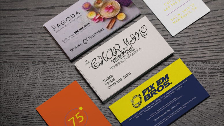
I’m sure you will agree with me when I say that a lot of first impressions for a business come from business cards. Socialization during business events involves giving out your business cards and receiving a ton of them as well. And while all of us are not designers, we are expected to hand out business cards with a professional, attractive, and attention-grabbing design. A bad business card design could land your card right in the trash. No pressure.
But the fact remains that business cards are quite tricky to design. Sure, you can simply put your name and contact details and be done with it. However, business cards that don’t properly reflect the business they represent, will fail to be memorable. Being forgotten by a business acquaintance is definitely a no-no.
If you avoid business card design pitfalls, you are already halfway there. To start, here are some of the more common characteristics of bad business card design.
1. Pixelated Graphics
You’d be surprised how pixelated graphics is a common bad business card design problem our prepress department comes across. Nothing ruins a good business card design more than the mess of blurry pixels.
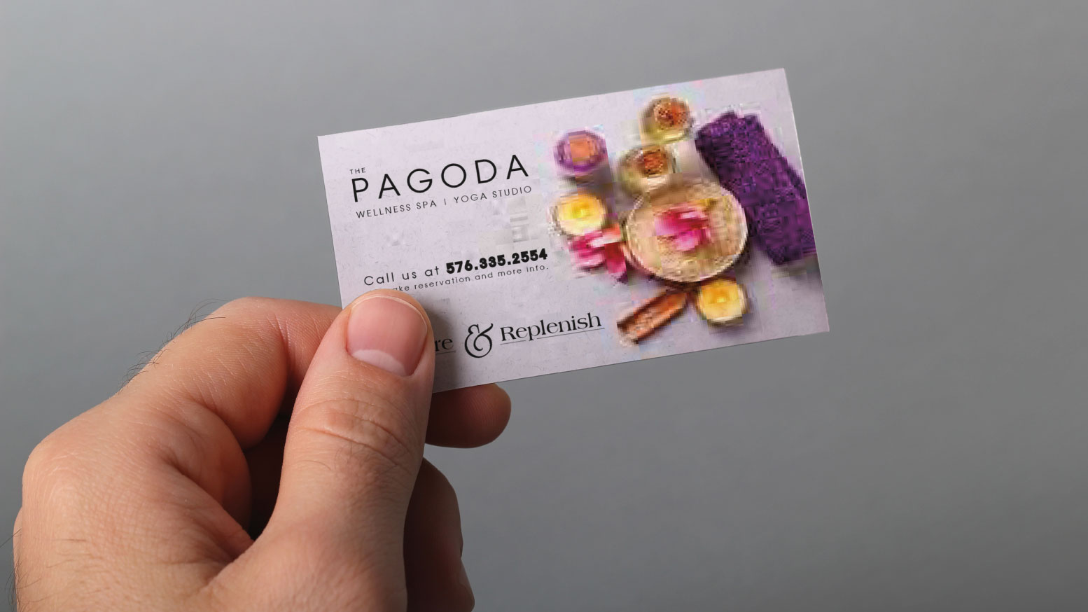
Just because it looks good on screen, it doesn’t mean that it looks the same in print. A good standard to follow, and something we always remind our customers, is to make sure that they use 300 dots per inch (dpi) when using their photo editing software. When getting images from the internet, make sure that it has a high resolution. If possible, used vector-based images to ensure that the quality is not lost when scaling it upwards.
2. Unreadable Text
Another common mistake when it comes to business card design is unreadable text. As a rule of thumb, if you need a magnifying lens to read your business card text, you probably need to increase it.
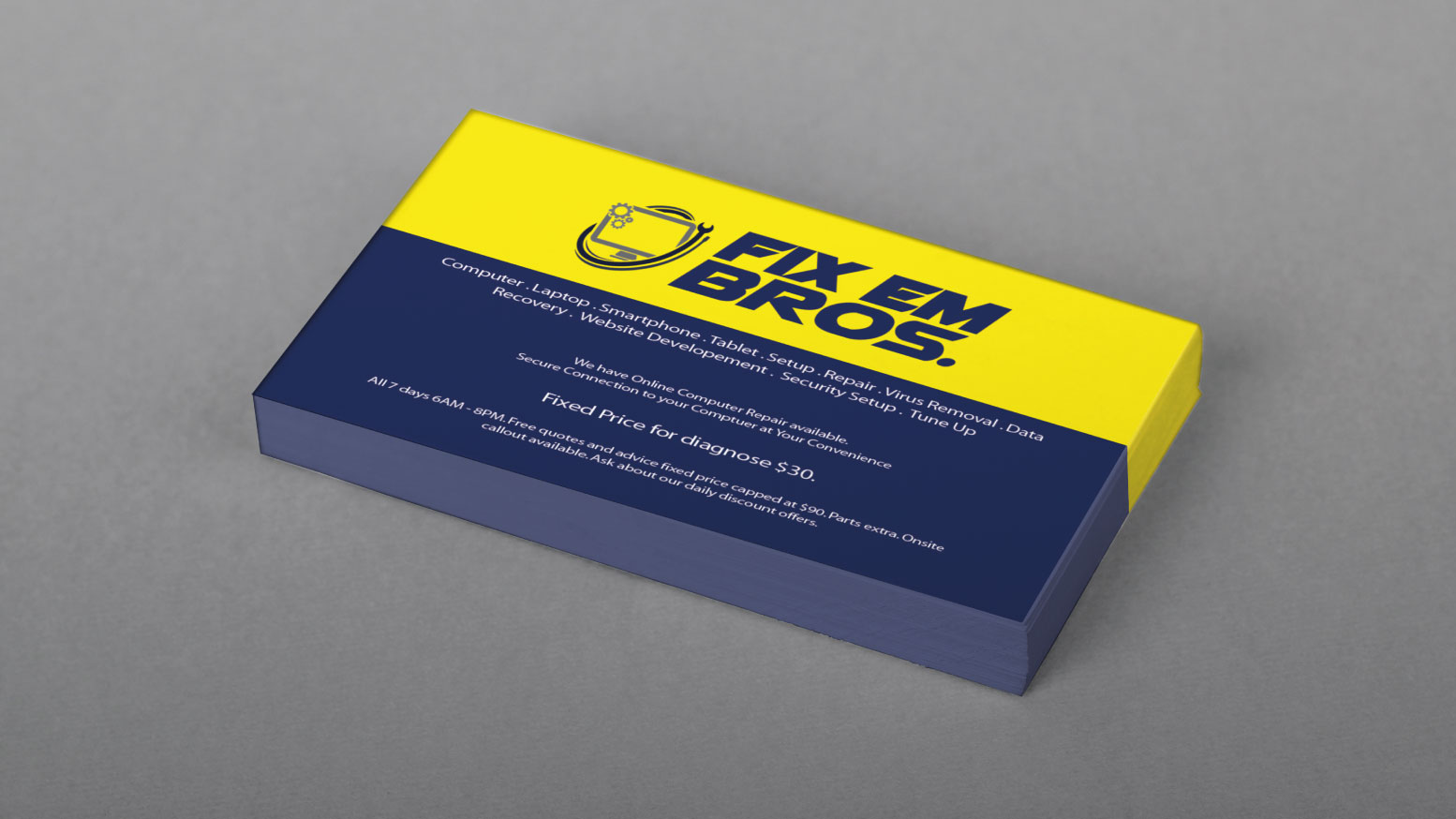
When designing a business card using a photo editing software, some people forget that the text needs to fit on a small card (typically 2” x 3.5”). You may be able to fit a lot of information in your card by using a small font,however, it won’t matter if your recipient can’t read it. A lot of people have bad eyesight, especially older business people. Use at least 7-8 pt font size and put a bit of white space around your text as breathing room, so it’s easy to read.
3. Poor Choice of Font(s)
This is actually one of my pet peeves. If I see fonts such as Comic Sans, Papyrus, or Scriptina, I automatically think that the owner of the card didn’t care enough to choose their fonts carefully.
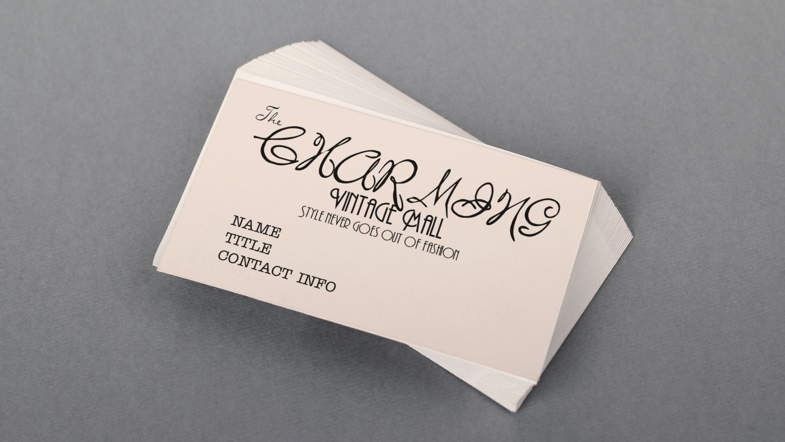
Most of the time, fonts do not fit the industry of the card owner. I would expect Comic Sans to be used for a nursery, but not for law services. There are a lot of articles about which fonts to use for business cards. If you are a fan of overused fonts, there are also some articles on font alternatives, such as this one from UCreative.
4. Startling Color Combination
When designers say, “use color to grab people’s attention,” it doesn’t mean that you should use bright colors all throughout your business card design. You need to learn some color basics to make sure that your business card looks professional and pleasing.
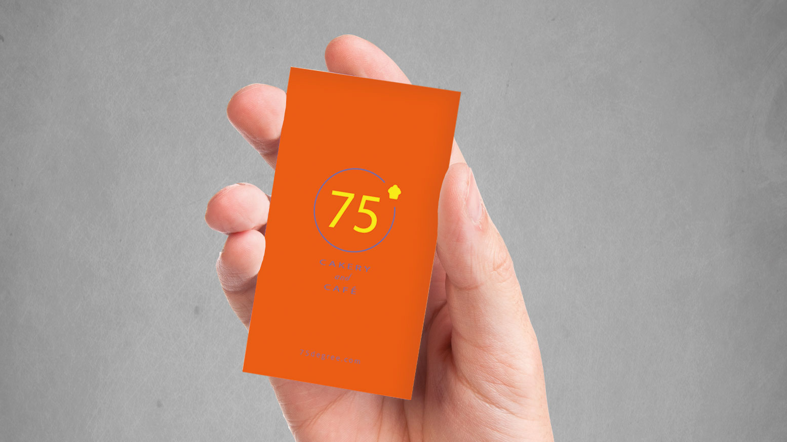
Another thing you should consider is the psychology behind color. There are several color associations you should research and then make sure to use what is appropriate for your line of business. For instance, red and orange make a person hungry so it would be best for restaurants. Green denotes nature, so it’s good to use it for landscaping services.
What other characteristics of bad business card design can you think of? Comment your suggestions below.


