


Understanding Color Using The Color Wheel
One of the key components of any print material will be your decision on colors. It is in your best interest to learn some color basics to help ensure your printed piece looks professional and is pleasing to the eye.
Colors can make a bold statement or can be calming and soothing. They can create an ambiance from warmth to elegance. Color is perhaps your most important design element.
What is the Color Wheel?
The Color Wheel is a basic tool for combining colors. It is usually based on 12 colors and it can help you pick harmonious choices when designing your material.
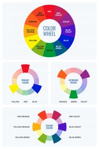
- The primary colors are red, yellow and blue.
- The secondary colors are green, orange and purple. These are achieved by mixing two primary colors.
- There are 6 tertiary colors — red-orange, orange-yellow, yellow-green, blue-green, blue-violet, and violet-red. These are achieved by mixing different primary and secondary colors.
Types of Color Combinations
An effective and meaningful design relies significantly on thoughtful color combinations. Here are some types of color combinations to consider for your next project.
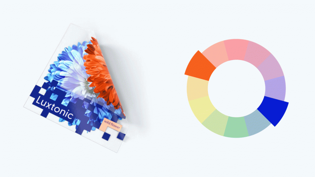
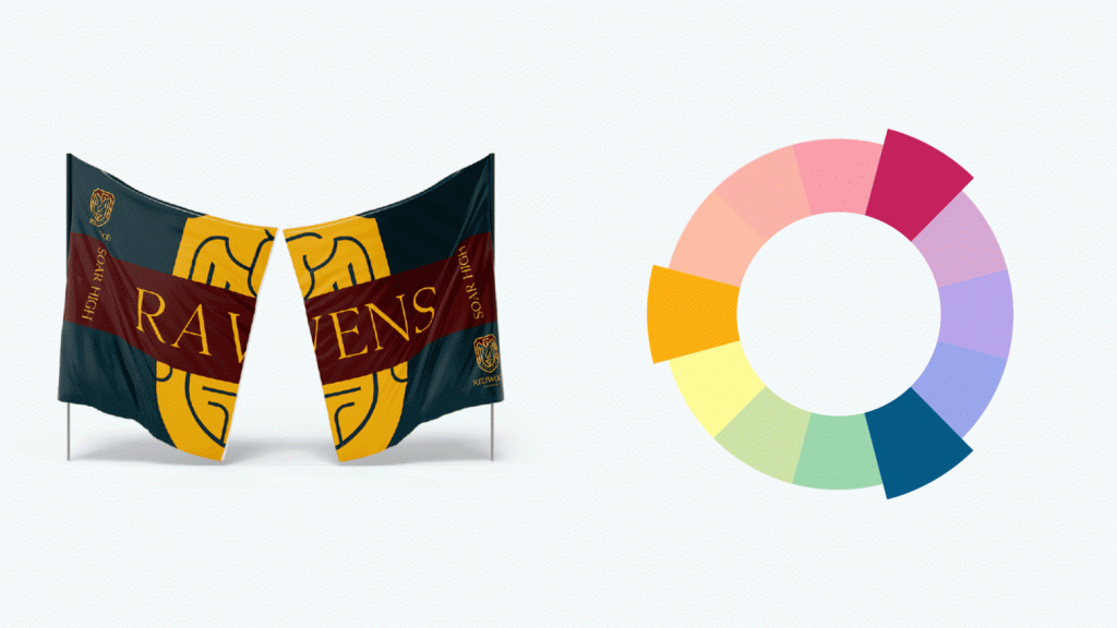
- Complementary
Found opposite each other on the color wheel, complementary colors create a high contrast and impactful pairing. This pairing adds vibrance and energy to your design.
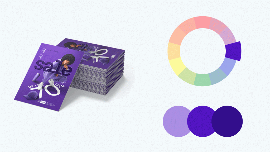
- Monochromatic
Monochromatic colors are derived from three shades, tones, and tints of one base color. With this combination, you can achieve a harmonious and sophisticated aesthetic.
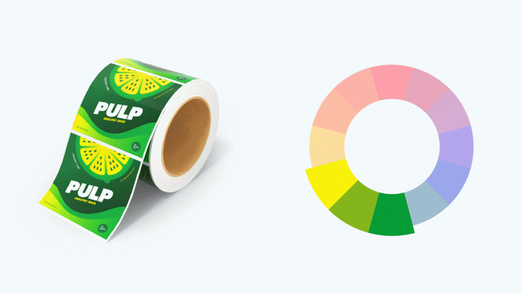
- Analogous
Analogous colors exhibit a subtle variation in hue as they sit side by side on the color wheel. This color combination is soothing and pleasant to the eyes.
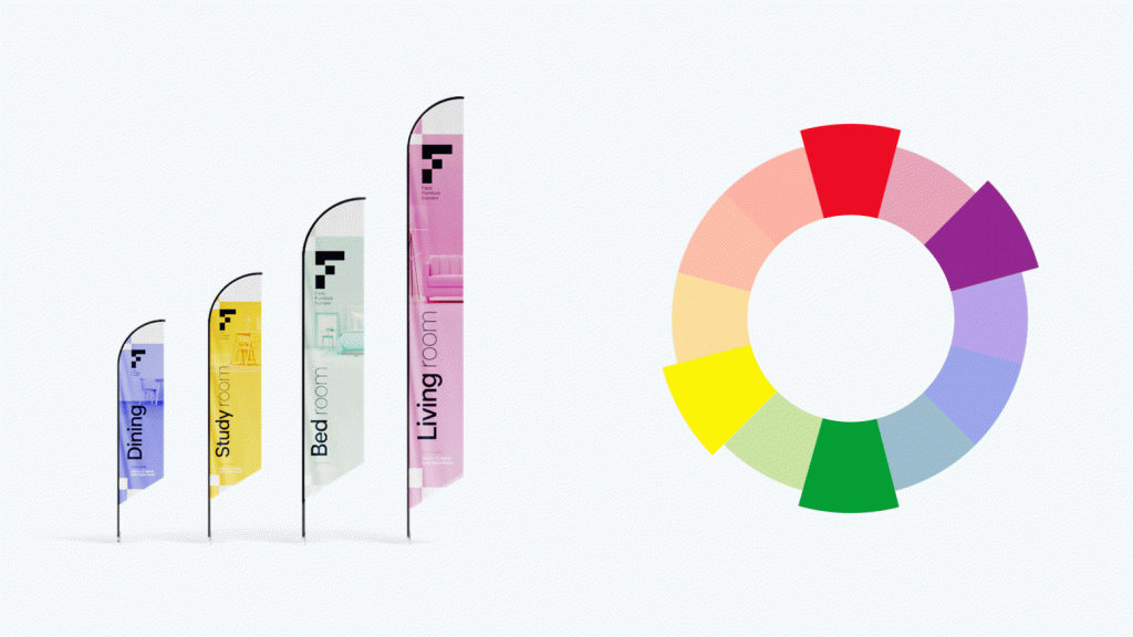
- Triadic
Triadic colors consist of colors that are three colors apart from each other on the color wheel. This combination of colors is slightly high contrast, resulting in a balanced and dynamic look.
- Tetradic
Choose two colors apart from each other on the color wheel, and you will get tetradic colors. This color scheme gives your design plenty of color variety, balancing both contrast and harmony. Use them sparingly, though — more colors in your palette make it harder to balance.
Color Temperature
The color wheel categorizes colors as warm and cool, with their warmth or coolness referred to as color temperature.
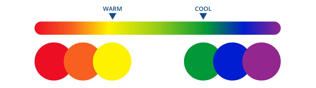
In color psychology, certain emotions are linked to these color temperatures. Warm colors such as red, orange, and yellow embody the vibrancy of the sun. In contrast, cool colors like blue, green, and purple exude calmness reminiscent of serene waters.
Understanding and knowing how to balance warm and cool colors contributes to the overall mood of a design.
Hue, Saturation, and Luminance
Any color on the color wheel is considered a hue, representing the base color without any alteration. In graphics editing, you can adjust a hue’s saturation and luminance.
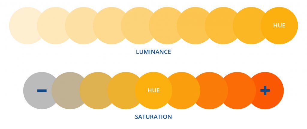
Saturation refers to the intensity or vividness of a color. Higher saturation means you get a more vibrant color, while lower saturation may result in a subdued or grayed look. Conversely, luminance is about how bright a color appears.
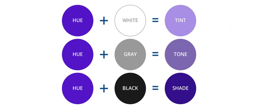
Shades, Tints, and Tones
Mixing any hue with black produces a shade, intensifying the color’s darkness and resulting in a deeper, richer hue.
On the other hand, blending white with any hue creates a tint, which lightens the color and reduces its intensity.
Now, when both black and white are added to a color, a tone is created — producing subtler variations of the original hue.
Learn More About Colors
Explore more color schemes and related topics with the resources below, and learn how choosing the right color for your design impacts the overall appearance of your print material.
- Basic Color Theory – This page tackles everything you need to know about color theory and how you can apply the concepts mentioned to the design of your print material. Includes images and additional resources.
- Color Scheme Designer – Although geared towards web designers, the site features a rich color palette and different color harmonies to help you test out which color works best with which. This should also allow you to copy and paste the RGB value of your color of choice, especially when you are creating a design using graphics editing software.
- Online Design Tool – If you have little or no design skills necessary to create compelling marketing tools for your business, use our easy-to-use design software. Aside from coming up with color combinations for your design, you can drag and drop shapes, text, and stock photos to come up with professional-looking print products.
 If you have questions about color usage and design for your printed materials, why not contact expert Graphic Designers at PrintRunner.com and ask them to help your design efforts? Describe your concept to our in-house designers, who will provide you a finished product after three days. You can use up to three revisions for your design until you’re happy. Click here for more information.
Explore Essential Print Products From Printrunner:
Custom Backdrops | Banners | Stickers | Labels | Carbonless Forms | Flyers | Business Cards | Postcards | Brochures | Catalogs | Hang Tags | Step and Repeat Banners
I like the idea that a brand is telling s history and its good fortune depends on whether take on that narrative or not.
Greetings! Very useful advice in this particular post!
It’s the little changes that produce the biggest changes. Thanks for sharing!